Designing a health legislation tracker app.
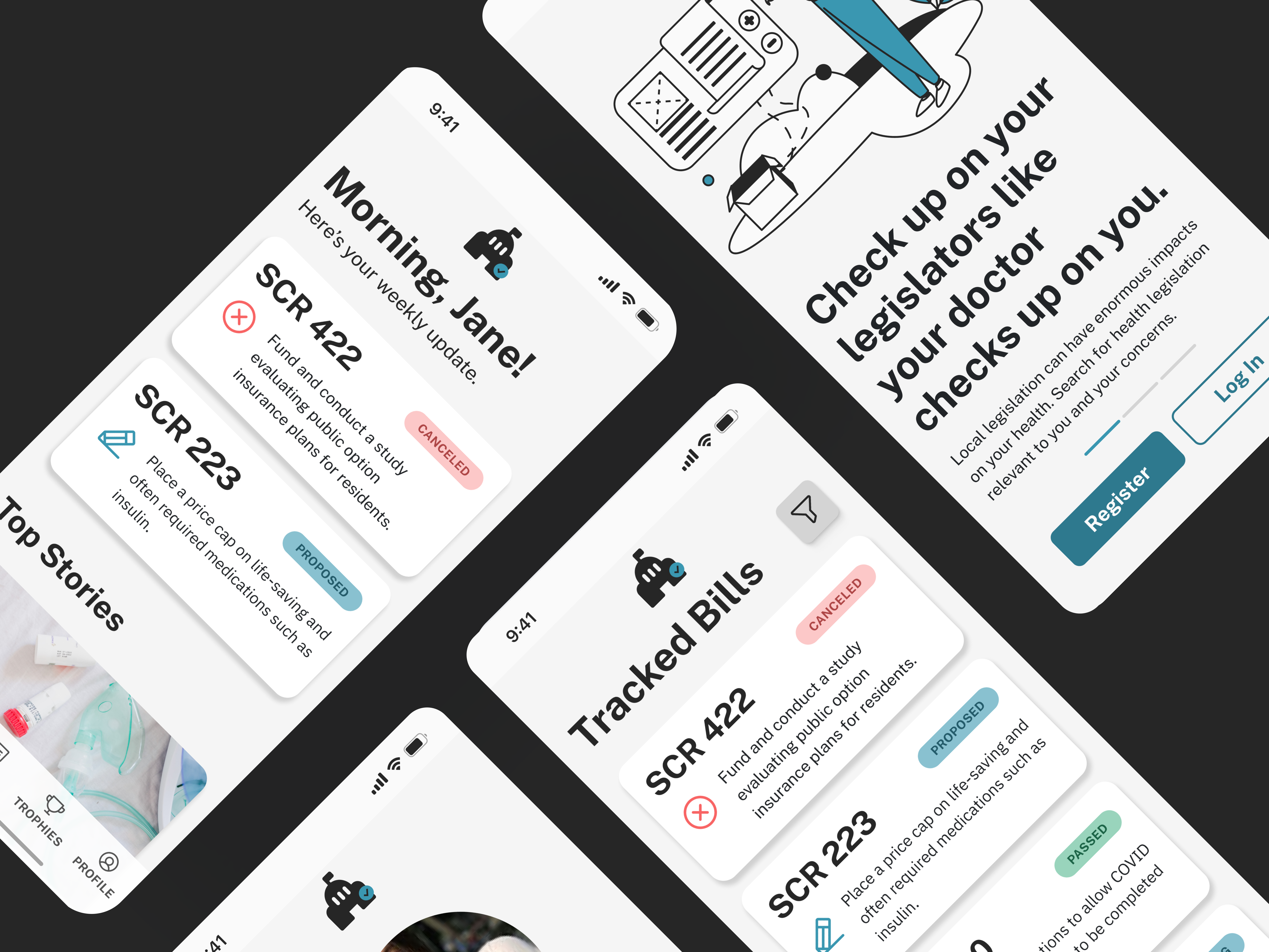
Making health care into local politics.
The political can be personal — especially if you have a health concern that makes it more relevant to you than the average person.
Most people in the U.S. focus on national health laws. However, local health laws, such as state expansions of low-income health care options like Medicaid, can be just as if not more important to the average person. In my time studying political science, I saw just how lacking easily accessible information was to most people — and to me, someone with a degree in the topic!
For this last project in the Coursera Google UX course, I decided to focus on health legislation and how to make it more accessible to the average person.
Responsibilities: User research, interviews, competitive audits, paper and digital wireframes, low and high-fidelity wireframing, usability studies, accessibility, design iteration.
Tools: Figma
Timeframe: Feb ‘22 - May ‘22
The Challenge
Most complicated political topics—namely health bills—aren’t understandable to an everyday audience, including those who are most directly affected. Those who do understand are often unsure of what actions to take next. Billcheck’s goal is to make U.S. citizens new and old capable of finding health legislation quick, efficient, and relevant to them while also offering ideas for next steps.Objectives & Research
User Surveys
I recruited a group of ten different individuals with ages ranging from 20 to 60. There was a range of political activism in the group, and only two of the individuals worked with health care or in a field relating to public health. From my interviews I discovered three main pain points.
- Confusion on terms: Most political topics are couched in formal and legal language that may be misleading. Adding medical topics into that create an even more severe barrier. Users expressed confusion about what terms might mean and often wished for simple and clear language.
- Difficulty finding relevant bills or laws: Users with different health needs wanted to see bills relevant to their needs, not just every bill related to health care in general. A few older individuals complained about having a hard time navigating their local government’s website. In other words, they wanted specificity over generalized content.
- No prompts for next actions: Calls to action are deeply important to political activism. Users indicated that they could gather that information through news sources, but didn’t know what to do with it afterwards, and often felt like they would lose track of a bill.
Most of these indicated confusion while trying to understand and categorize information, not issues with finding information in and of itself, as well as what to do afterwards.
Competitive Audit
Running a competitive audit was surprisingly difficult. There were very few competitors to what I wanted to make, especially with a health focus, but I managed to find a few that were more website-based, as well as one app (Causes). There were a few gaps in the market that I immediately noticed. To illustrate these I’ll be using Bill Track 50, a website which includes local legislation, and Causes, a platform which combines social media and political knowledge.
- Interfaces were often archaic and difficult to read. Bill Check 50 has, without a doubt, one of the better interfaces, but the main feature screen appears to be set up more for something like a tablet.
- Most apps were full of information, but designed for experienced political activists or those with pre-existing strong political interest. Bill Check 50’s Bill Search feature requires you to search certain terms. I tried some common health vocabulary, and I was clearly searching the wrong thing. No results at all. This is difficult for someone new to political topics.
- Those that were more user-focused often had a social media leaning and included how to contact your representative, but not as much info beyond that. Calls to action are deeply important to political activism. Users indicated that they could gather that information through news sources, but didn’t know what to do with it afterwards, and often felt like they would lose track of a bill.
Personas & User Journey
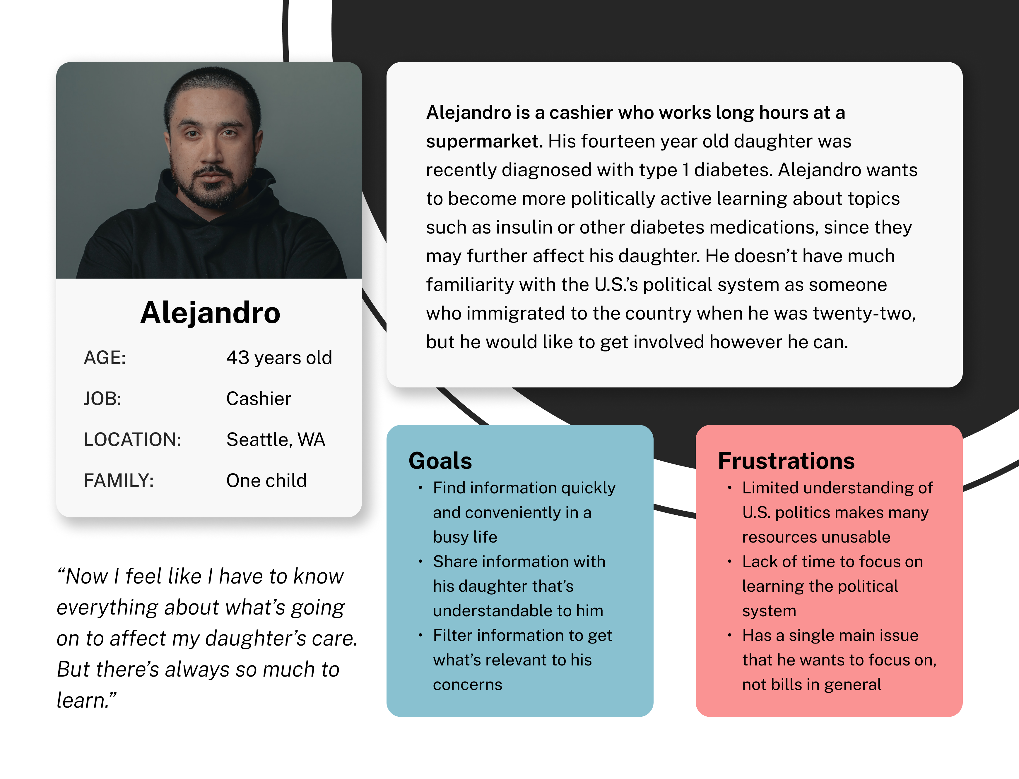
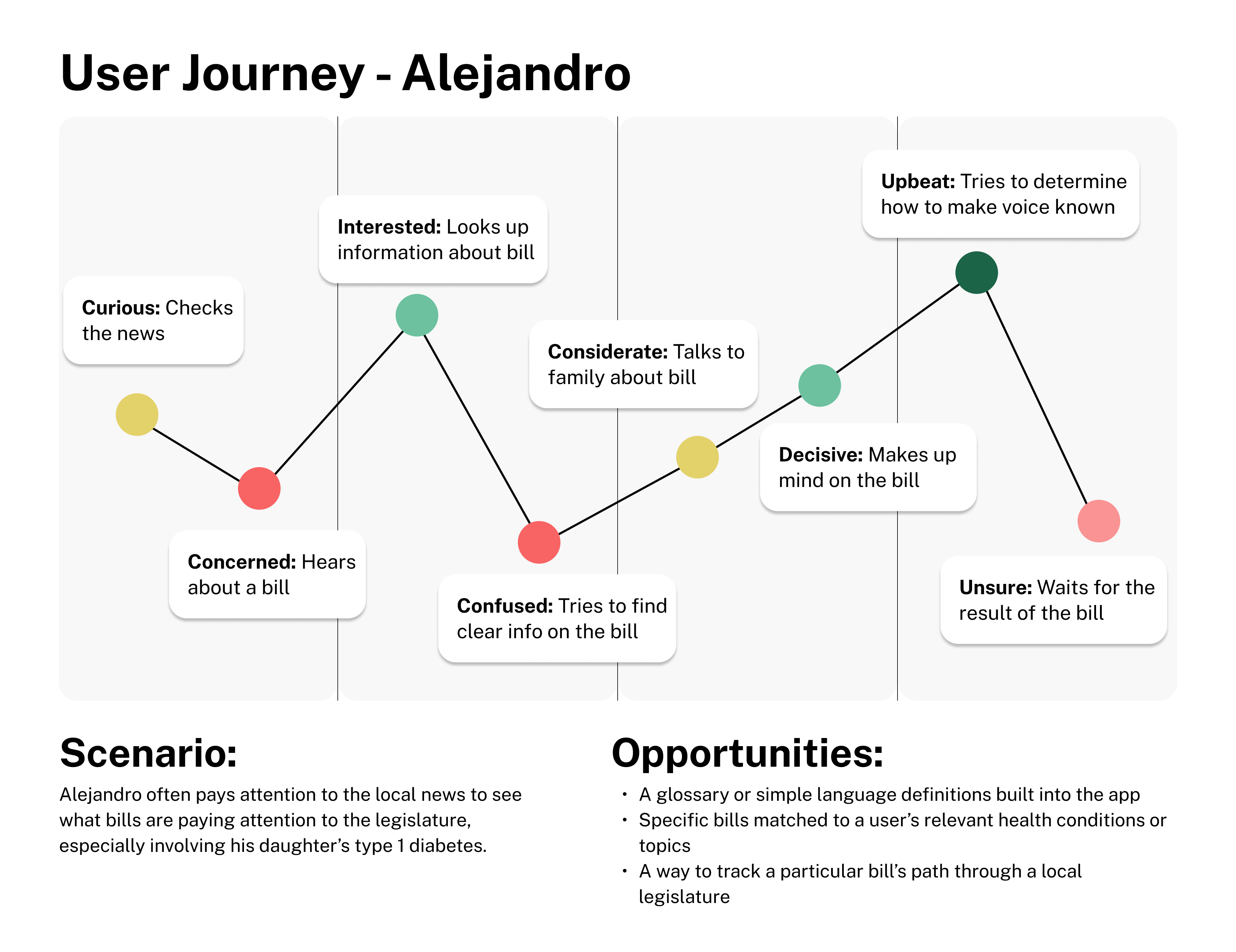
The user journey helped me identify a few specific places where improvements could be made, especially while considering the previous pain points.
- A glossary or simple language definitions built into the app
- Specific bills matched to a user’s relevant health conditions or topics
- A way to track a particular bill’s path through a local legislature
Design & Refinement
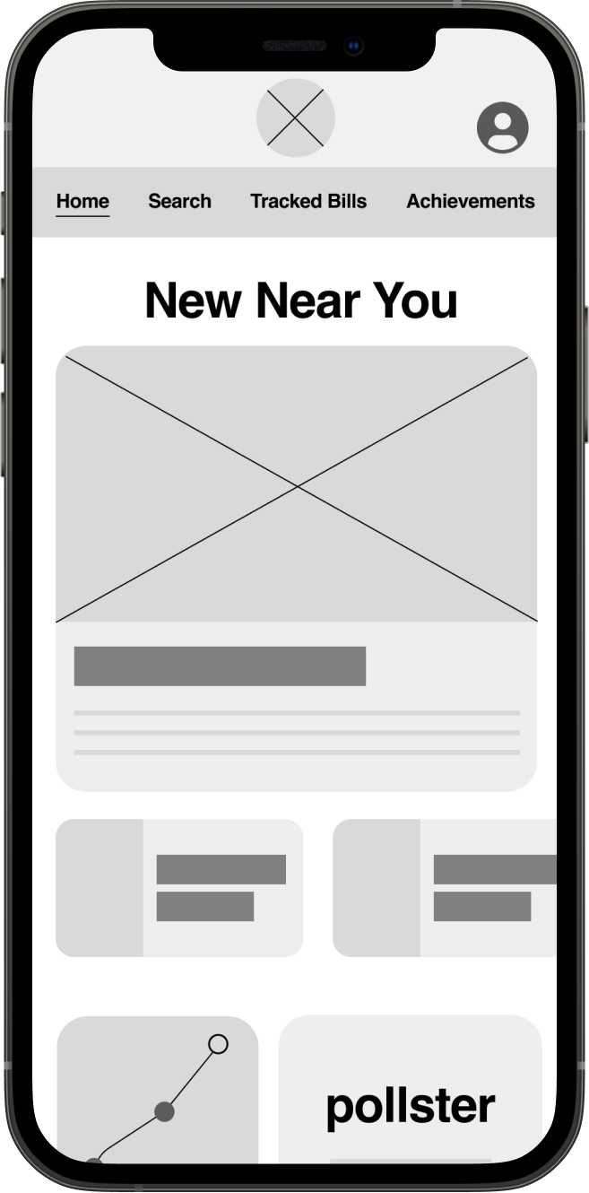
Digital Wireframes
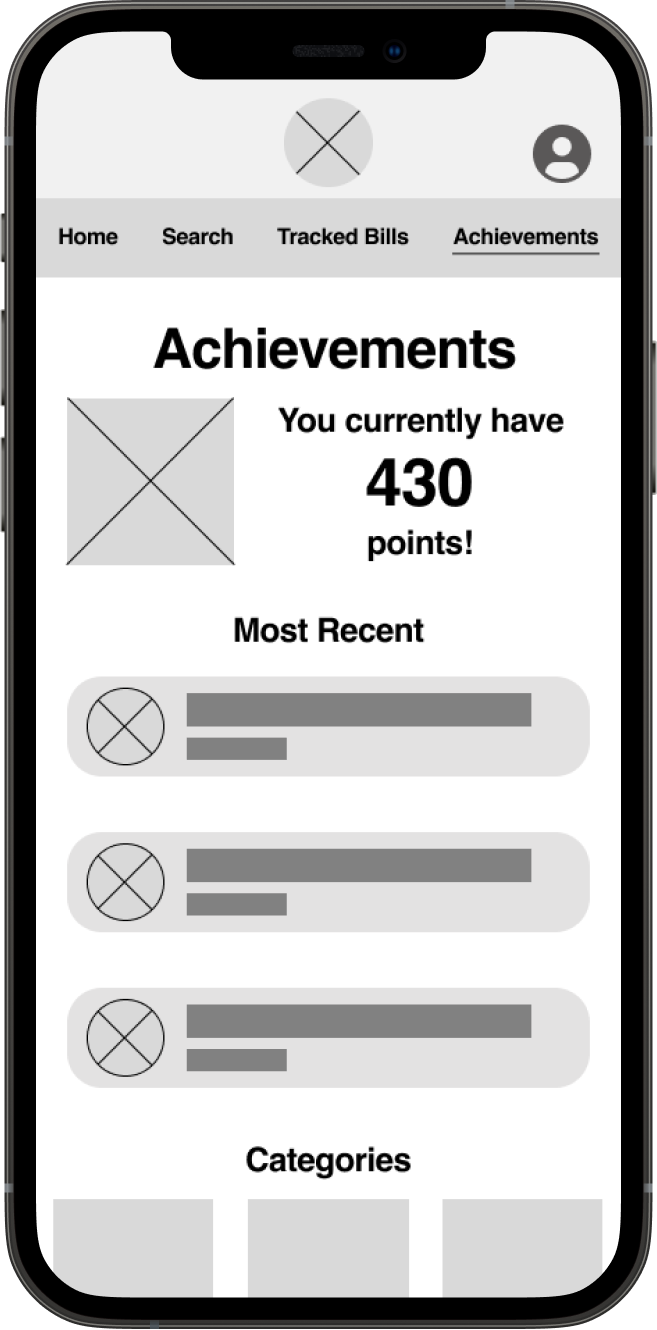
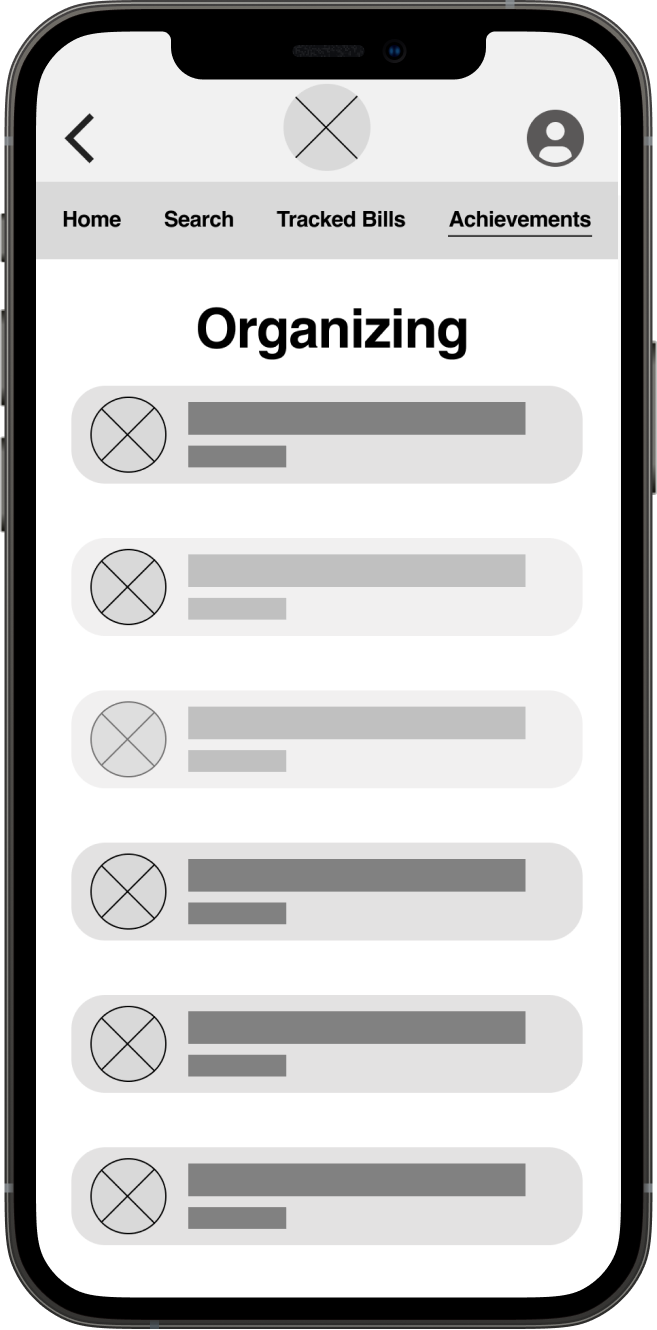
Lo-Fi Prototype
I wanted to experiment with a few things I hadn’t used before: topbar tab menus, as well as an emphasis on cards with text and images involved. I also wanted to make sure that people had next steps involved, so I created an achievements section.
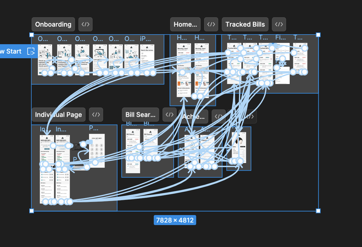
From here, I began animating. The most complex part of this was actually making sure every single topbar connected appropriately. Although this seemed easy, and was by the end, it took more care than I anticipated.
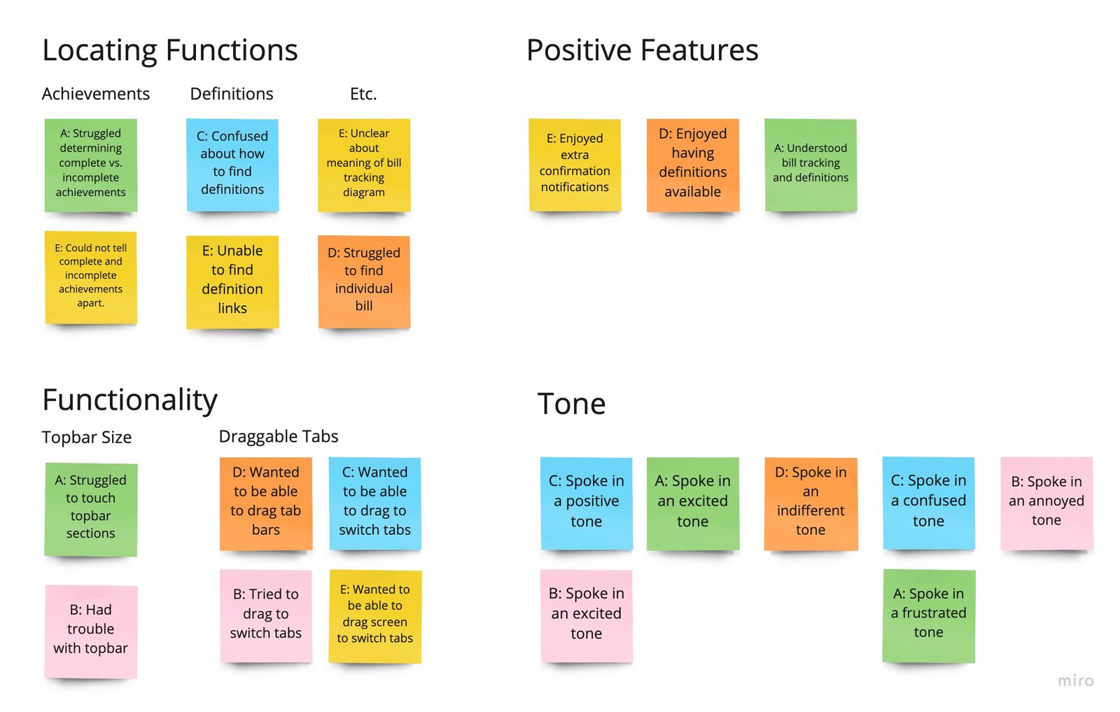
I conducted five usability tests with multiple individuals. These were moderated remote usability studies. They attempted to complete the onboarding process, find bills, and look at the achievements page.
- Topbar height. Most users had some trouble with the height of the topbar, complaining about the height of it making it more difficult to touch. This is an enormous amount of lost functionality.
- Swipe navigation. Most users intuitively saw the topbar tabs as a sign of swipe functions (such as with Instagram or Dribbble), and became frustrated when attempting to use a function that did not exist.
- Clearer indicators (text, colors, icons). Most users were confused by indicators of certain links (i.e. definitions in bill descriptions) and which achievements were complete or not.
Style Guide
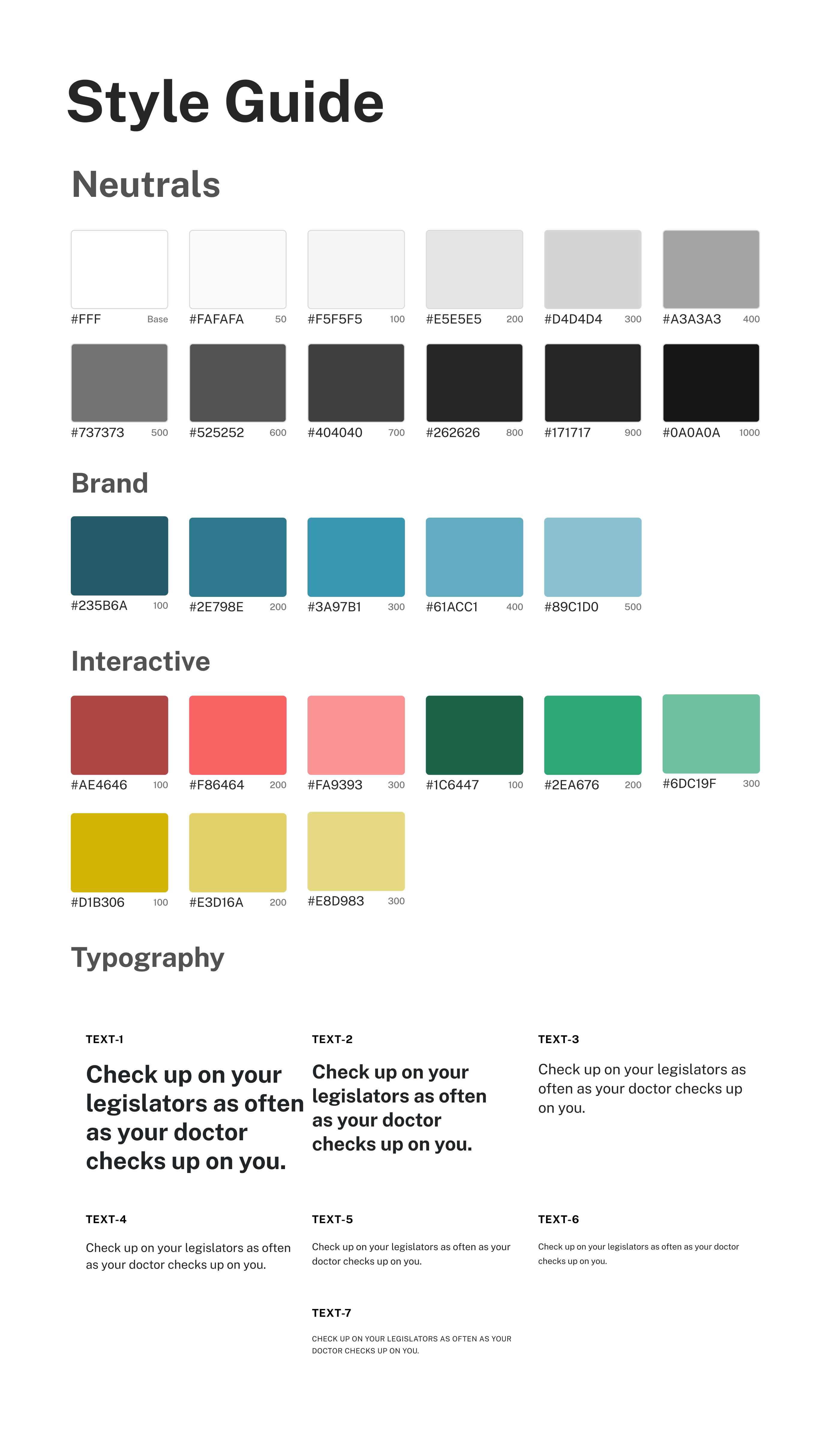
My past work had involved color or dark mode. I wanted to emphasize something clean and easy to understand, so I picked two complimentary colors of blue and orange. The blue was more soothing and seemed friendlier, while the orange was a sharp accent that, to me, created feelings of action and activity. I decided to use Space Grotesk for my headlines and IBM Plex Sans for my body. These were easily available fonts from Google. Space Grotesk, to me, looked modern and almost slightly playful with its mix of sharp corners and curves, while IBM Plex Sans was easily readable on screens.
I made sure to avoid flat white and flat black (#FFF and #000 respectively) for my background and text, as my web design history had taught me that these could sometimes be jarring in certain environments when placed on top of each other.I conducted five usability tests with multiple individuals. These were moderated remote usability studies. They attempted to complete the onboarding process, find bills, and look at the achievements page.
Hi-Fi Prototype
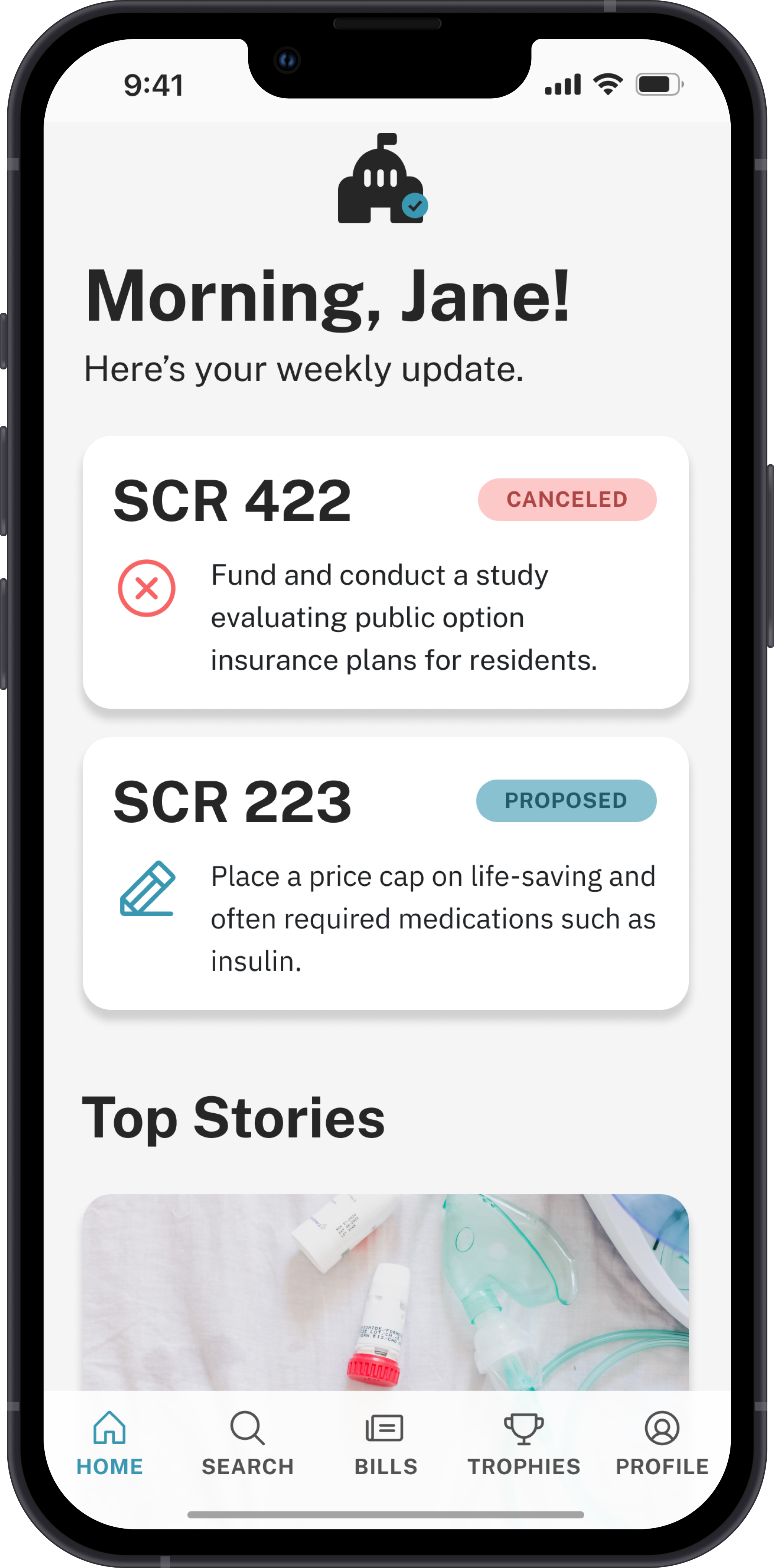
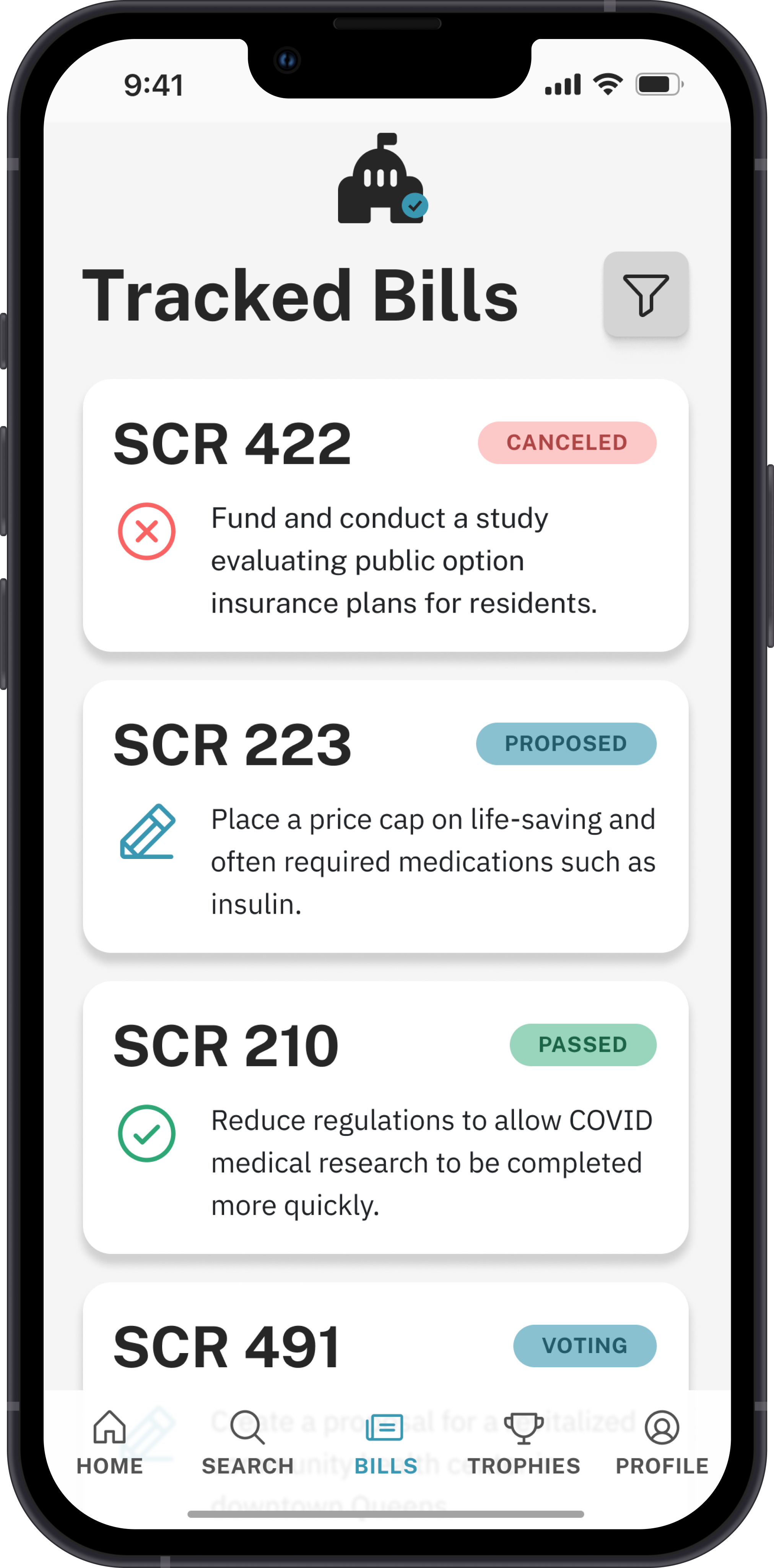
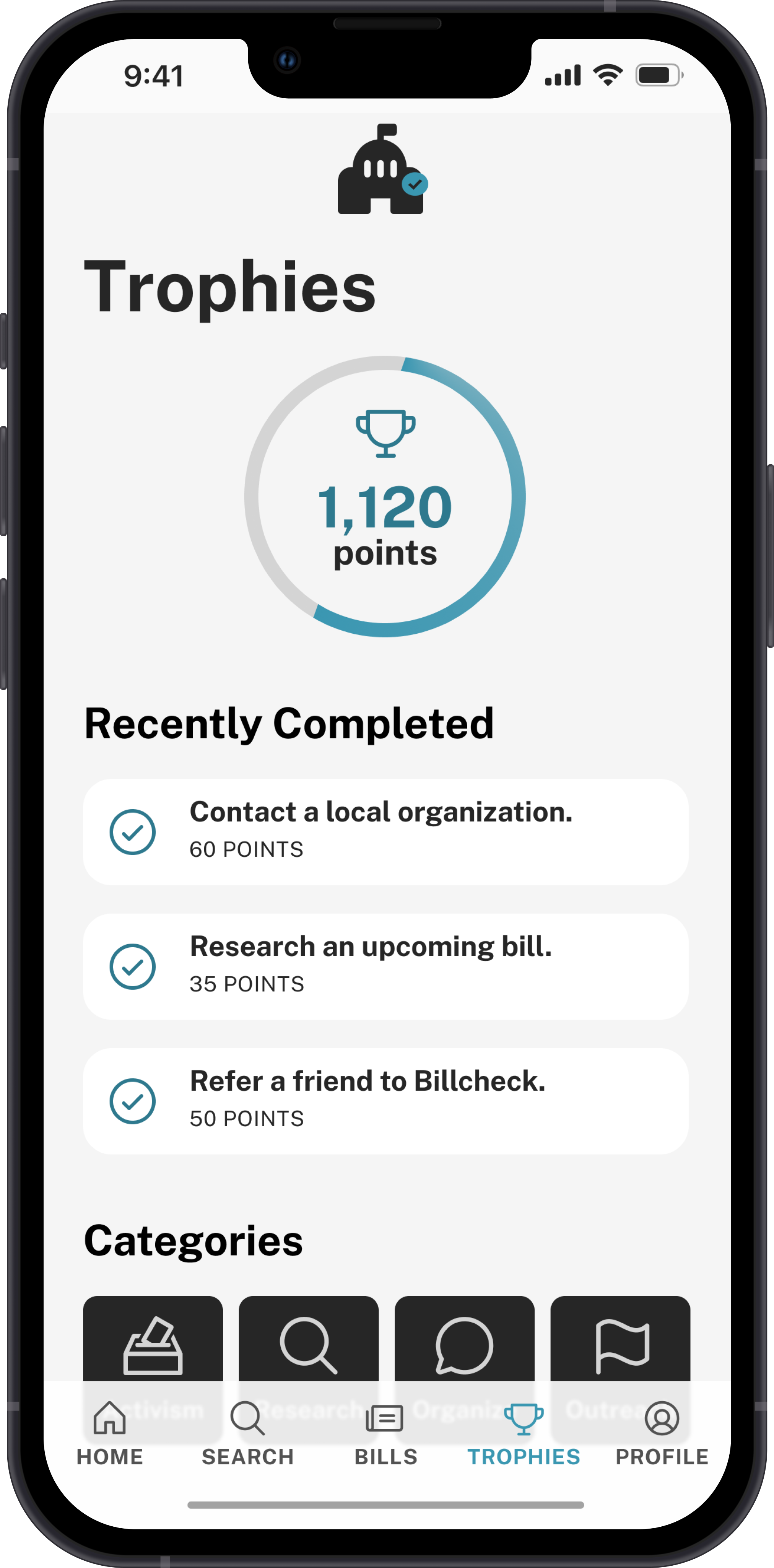
Here, I ran into some of the issues with Figma. Figma’s smart animate feature is great, but sometimes it picks up on the wrong things. I had to compromise on some of the animations in order to get what I wanted done with the swiping.I also decided to decrease the amount of orange even more, in order to keep it from overwhelming the rest of the prototype. I integrated animations on onboarding and animations on the home page to make it feel more dynamic and alive, but in text and information-heavy pages, I used less animation to keep from distracting the user.
Results & Reflections
This project taught me a lot about some of Figma's limitations. I ran into issues with its implementation of something I’d done before in web design: sticky topbars. I hypothetically wanted to be able to create more sticky elements on scroll, but Figma wasn’t friendly towards this idea. I also learned just how much a style guide can make creation easier.
Card design is something that is useful to categorize and, in a way, herd in information. Grouping is a powerful tool in UX, and I came to realize just how important it could be as I began to both distinguish between certain sections and repeat designs in other sections to associate them.
What I wanted was an app that was personalized towards health legislation, relevant to an area, and friendly rather than archaic. I believe I succeeded in this regard, and I’m proud of the work I did.
Given more time and a budget, I would complete further usability tests, and I would build in more features such as a glossary. For this project I decided to limit myself to the core functions needed from the initial problem statements: definitions, relevant legislation, and calls to action. However, I believe this could be expanded without harming the focus of Billcheck.